Data visualisation
So far we have been learning how to crunch data. Now we will look into how to visualise it.
There are two main purposes of representing data visually:
- To explore the data
- To convey a message to an audience
In this chapter we will look at how both of these can be accomplished using R and its associated ggplot2 package. This choice is based on ggplot2 being one of the best plotting tools available. It is easy to use and has got sensible defaults that result in beautiful plots out of the box. An added advantage is that this gives us a means to get more familiar with R, which is an awesome tool for statistical computing (although this topic is beyond the scope of this book). Other tools will be discussed later in the section Other useful tools for scripting the generation of figures.
We will start off by exploring Fisher’s Iris flower data set. This will be an exercise in data exploration.
Finally, we will use R and ggplot2 to build up a sliding window plot of the GC content data from the Data analysis chapter. This will serve to illustrate some points to consider when trying to convey a message to an audience.
Starting R and loading the Iris flower data set
R like Python can be run in an interactive shell. This is a great way to
get familiar with R. To access R’s interactive shell simply type R into your terminal and press enter.
$ R

R version 3.2.2 (2015-08-14) -- "Fire Safety"
Copyright (C) 2015 The R Foundation for Statistical Computing
Platform: x86_64-apple-darwin14.5.0 (64-bit)

R is free software and comes with ABSOLUTELY NO WARRANTY.
You are welcome to redistribute it under certain conditions.
Type 'license()' or 'licence()' for distribution details.

  Natural language support but running in an English locale

R is a collaborative project with many contributors.
Type 'contributors()' for more information and
'citation()' on how to cite R or R packages in publications.

Type 'demo()' for some demos, 'help()' for on-line help, or
'help.start()' for an HTML browser interface to help.
Type 'q()' to quit R.

>
R comes bundled with a number of data sets. To view these you can use the
data() function, which lists all the available data sets.
> data()
Data sets in package ‘datasets’:

AirPassengers           Monthly Airline Passenger Numbers 1949-1960
BJsales                 Sales Data with Leading Indicator
BJsales.lead (BJsales)
                        Sales Data with Leading Indicator
BOD                     Biochemical Oxygen Demand
CO2                     Carbon Dioxide Uptake in Grass Plants
...
If you want to stop displaying the data sets without having to scroll to the
bottom press the q button on your keyboard.
We are interested in the Iris flower data set, called iris, let us load
it.
> data(iris)
This loads the iris data set into the workspace. You can list the content
of the workspace using the ls() function.
> ls()
[1] "iris"
Understanding the structure of the iris data set
First of all let us find out about the internal structure of the iris data set using the str() funciton.
> str(iris)
'data.frame':   150 obs. of  5 variables:
 $ Sepal.Length: num  5.1 4.9 4.7 4.6 5 5.4 4.6 5 4.4 4.9 ...
 $ Sepal.Width : num  3.5 3 3.2 3.1 3.6 3.9 3.4 3.4 2.9 3.1 ...
 $ Petal.Length: num  1.4 1.4 1.3 1.5 1.4 1.7 1.4 1.5 1.4 1.5 ...
 $ Petal.Width : num  0.2 0.2 0.2 0.2 0.2 0.4 0.3 0.2 0.2 0.1 ...
 $ Species     : Factor w/ 3 levels "setosa","versicolor",..: 1 1 1 1 1 1 1 1 1 1 ...
This reveals that the iris data set is a data frame with 150 observations
and five variables. It is also worth noting that Species is recorded as
a Factor data structure. This means that it has categorical data. In this case
three different species.
In R a data frame is a data structure for storing two-dimensional data. In a data frame each column contains the same type of data and each row has values for each column.
You can find the names of the columns in a data frame using the names() function.
> names(iris)
[1] "Sepal.Length" "Sepal.Width"  "Petal.Length" "Petal.Width"  "Species"
To find the number of columns and rows one can use the ncol() and
nrow() functions, respectively.
> ncol(iris)
[1] 5
> nrow(iris)
[1] 150
To view the first six rows of a data frame one can use the head() function.
    > head(iris)
  Sepal.Length Sepal.Width Petal.Length Petal.Width Species
1          5.1         3.5          1.4         0.2  setosa
2          4.9         3.0          1.4         0.2  setosa
3          4.7         3.2          1.3         0.2  setosa
4          4.6         3.1          1.5         0.2  setosa
5          5.0         3.6          1.4         0.2  setosa
6          5.4         3.9          1.7         0.4  setosa
To view the last six rows of a data frame one can use the tail() function.
> tail(iris)
    Sepal.Length Sepal.Width Petal.Length Petal.Width   Species
145          6.7         3.3          5.7         2.5 virginica
146          6.7         3.0          5.2         2.3 virginica
147          6.3         2.5          5.0         1.9 virginica
148          6.5         3.0          5.2         2.0 virginica
149          6.2         3.4          5.4         2.3 virginica
150          5.9         3.0          5.1         1.8 virginica
Warning
Often the most difficult aspect of data visualisation using R and
ggplot2 is getting the data into the right structure. The iris
data set is well structured in the sense that each observation is
recorded as a separate row and each row has the same number of columns.
Furthermore, each column in a row has a value, note for example
how each row has a value indicating the Species.
Once your data is well structured plotting it becomes relatively
easy. However, if you are used to adding heterogeneous data to Excel
the biggest issue that you will face is formatting the data so that
it becomes well structured and can be loaded as a data frame in R.
For more detail on how to structure your data see
Tidy data.
A note on statistics in R
Although this book is not about statistics it is worth mentioning that R is a
superb tool for doing statistics. It has many built in functions for statistical
computing. For example to calculate the median Sepal.Length for the iris
data one can use the built in median() function.
> median(iris$Sepal.Length)
[1] 5.8
In the above the $ symbol is used to specify the column of interest in the
data frame.
Another useful tool for getting an overview of a data set is the
summary() function.
> summary(iris)
  Sepal.Length    Sepal.Width     Petal.Length    Petal.Width
 Min.   :4.300   Min.   :2.000   Min.   :1.000   Min.   :0.100
 1st Qu.:5.100   1st Qu.:2.800   1st Qu.:1.600   1st Qu.:0.300
 Median :5.800   Median :3.000   Median :4.350   Median :1.300
 Mean   :5.843   Mean   :3.057   Mean   :3.758   Mean   :1.199
 3rd Qu.:6.400   3rd Qu.:3.300   3rd Qu.:5.100   3rd Qu.:1.800
 Max.   :7.900   Max.   :4.400   Max.   :6.900   Max.   :2.500
       Species
 setosa    :50
 versicolor:50
 virginica :50
Default plotting in R
Before using ggplot2 let us have a look at how to generate default plots in R.
First of all let us plot a histogram of the Sepal.Length
(Fig. 6).
> hist(iris$Sepal.Length)
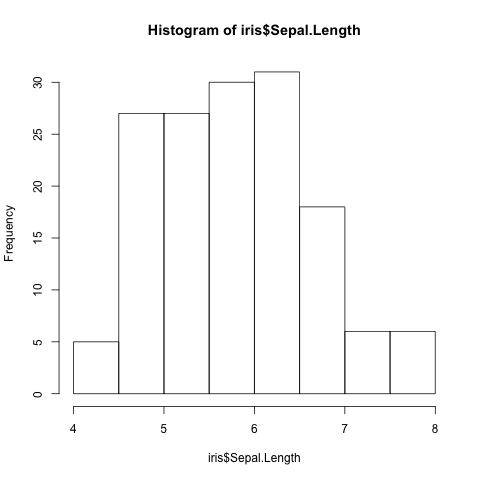
Fig. 6 Histogram of Iris sepal length data generated using R’s built in hist()
function.
Scatter plots can be produced using the plot() function.
The command below produces a scatter plot of Sepal.Width
versus Sepal.Length (Fig. 7).
> plot(iris$Sepal.Length, iris$Sepal.Width)
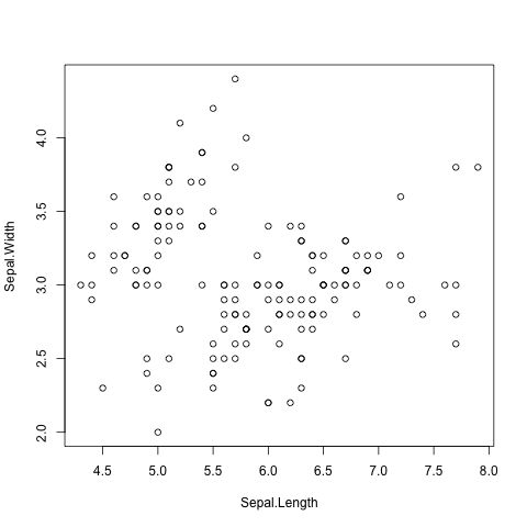
Fig. 7 Scatter plot of Iris sepal length vs width generated using R’s built in plot()
function.
Finally, a decent overview of the all data can be obtained by passing the
entire data frame to the plot() function (Fig. 8).
> plot(iris)
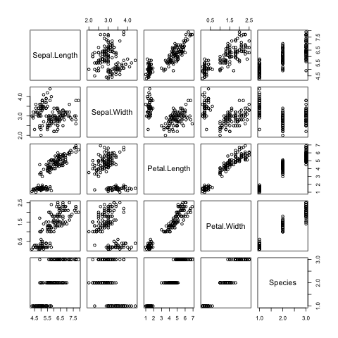
Fig. 8 Overview plot of Iris data using R’s built in plot() function.
R’s built in plotting functions are useful for getting quick exploratory views of the data. However, they are a bit dull. In the next section we will make use of the ggplot2 package to make more visually pleasing and informative figures.
Installing the ggplot2 package
If you haven’t used it before you will need to install the ggplot2 package. Detailed instructions can be found in Installing R packages. In summary you need to run the command below.
> install.packages("ggplot2")
Loading the ggplot2 package
In order to make use of the ggplot2 package we need to load it. This is achieved
using the library() function.
> library("ggplot2")
Plotting using ggplot2
To get an idea of what it feels like to work with ggplot2 let us re-create the previous histogram and scatter plot with it.
Let us start with the histogram (Fig. 9).
> ggplot(data=iris, mapping=aes(Sepal.Length)) + geom_histogram()
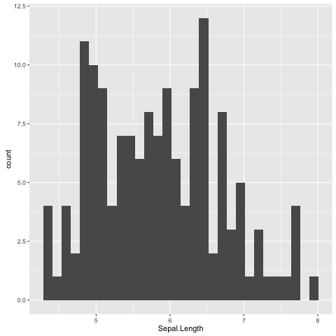
Fig. 9 Histogram of Iris sepal length data generated using R’s ggplot2 package.
The default bin width used is different from the one used by R’s built in hist()
function, hence the difference in the appearance of the distribution.
The syntax used may look a little bit strange at first. However, before going into more details about what it all means let’s create the scatter plot (Fig. 10) to get a better feeling of how to work with ggplot2.
> ggplot(data=iris, mapping=aes(x=Sepal.Length, y=Sepal.Width)) + geom_point()
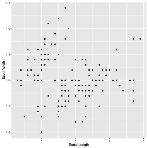
Fig. 10 Scatter plot of Iris sepal length vs width generated using R’s ggplot2 package.
In the examples above we provide the ggplot() function with two
arguments data and mapping. The former contains the data frame
of interest and the latter specifies the columns(s) to be plotted.
The ggplot function returns a ggplot object that can be plotted. However,
in order to view an actual plot one needs to add a layer to the ggplot object
defining how the data should be presented. In the examples above this is
achieved using the + geom_histogram() and + geom_point() syntax.
A ggplot object consists of separate layers. The reason for separating out the generation of a figure into separate layers is to allow the user to better be able to reason about the best way to represent the data.
The three layers that we have come across so far are:
- Data: the data to be plotted
- Aesthetic: how the data should be mapped to the aesthetics of the plot
- Geom: what type of plot should be used
Of the above the “aesthetic” layer is the trickiest to get one’s head around.
However, take for example the scatter plot, one aesthetic choice that we have
made for that plot is that the Sepal.Length should be on the x-axis and
the Sepal.Width should be on the y-axis.
To reinforce this let us augment the scatter plot by sizing the points in the
scatter plot by the Petal.Width and coloring them by the Species
(Fig. 11), all
of which could be considered to be aesthetic aspects of how to plot the data.
> ggplot(iris, aes(x=Sepal.Length,
+                  y=Sepal.Width,
+                  size=Petal.Width,
+                  color=Species)) + geom_point()
In the above the secondary prompt, represented by the plus character (+),
denotes a continuation line. In other words R interprets the above as one line of code.
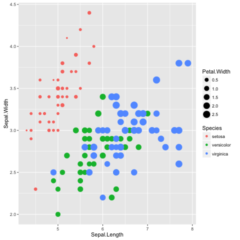
Fig. 11 Scatter plot of Iris sepal length vs width, where the size of each point represents the petal width and the colour is used to indicate the species.
The information in the scatterplot is now four dimensional! The x- and y-axis
show Sepal.Length and Sepal.Width, the size of the point indicates the
Petal.Width and the colour shows the Species. By adding
Petal.Width and Species as additional aesthetic attributes to the
figure we can start to discern structure that was previously hidden.
Available “Geoms”
The ggplot2 package comes bundled with a wide range of geoms (“geometries” for
plotting data). So far we have seen geom_histogram() and geom_point().
To find out what other geoms are available you can start typing geom_ into
a R session and hit the Tab key to list the available geoms using tab-completion.
> geom_
geom_abline      geom_errorbarh   geom_quantile
geom_area        geom_freqpoly    geom_raster
geom_bar         geom_hex         geom_rect
geom_bin2d       geom_histogram   geom_ribbon
geom_blank       geom_hline       geom_rug
geom_boxplot     geom_jitter      geom_segment
geom_contour     geom_label       geom_smooth
geom_count       geom_line        geom_spoke
geom_crossbar    geom_linerange   geom_step
geom_curve       geom_map         geom_text
geom_density     geom_path        geom_tile
geom_density_2d  geom_point       geom_violin
geom_density2d   geom_pointrange  geom_vline
geom_dotplot     geom_polygon
geom_errorbar    geom_qq
These work largely as expected, for example the geom_boxplot() results in a
boxplot and the geom_line() results in a line plot. For illustrations
of these different geoms in action have a look at the
examples in the ggplot2 documentation.
Scripting data visualisation
Now that we have a basic understanding of how to interact with R and the functionality in the ggplot library, let’s take a step towards automating the figure generation by recording the steps required to plot the data in a script.
Let us work on the histogram example. In the code below we store the ggplot
object in the variable g and make use of ggsave() to write the plot to
a file named iris_sepal_length_histogram.png. Save the code below to a file named
iris_sepal_length_histogram.R using your favorite text editor.
library("ggplot2")
data(iris)

g <- ggplot(data=iris, aes(Sepal.Length)) +
     geom_histogram()

ggsave('iris_sepal_length_histogram.png')
To run this code we make use of the program Rscript, which comes bundled with your
R installation.
$ Rscript iris_sepal_length_histogram.R
This will write the file iris_sepal_length_histogram.png to your current working
directory.
Faceting
In the extended scatterplot example (Fig. 11) we found that it was useful to be able to visualise which data points belonged to which species. Maybe it would be useful to do something similar with the data in our histogram.
In order to achieve this ggplot2 provides the concept of faceting,
the ability to split your data by one or more variables. Let us split the
data by Species using the facet_grid() function
(Fig. 12).
library("ggplot2")
data(iris)

g <- ggplot(data=iris, aes(Sepal.Length)) +
     geom_histogram() +
     facet_grid(Species ~ .)

ggsave('iris_sepal_length_histogram.png')
In the above the facet_grid(Species ~ .) states that we want one
Species per row, as opposed to one species per column
(facet_grid(. ~ Species)). Replacing the dot (.) with another
variable would result in faceting the data into a two dimensional grid.
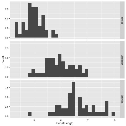
Fig. 12 Histogram of Iris sepal length data faceted by species.
Faceting is a really powerful feature of ggplot2! It allows you to easily split data based on one or more variables and can result in insights about underlying structures and multivariate trends.
Adding more colour
The faceted histogram plot (Fig. 12) clearly illustrates that there are differences in the distributions of the sepal length between the different Iris species.
However, suppose that the faceted histogram figure was meant to be displayed next to the extended scatter plot (Fig. 11). To make it easier to make the mental connection between the two data representations it may be useful to colour the histograms by species as well.
The colour of a histogram is an aesthetic characteristic. Let us add the fill colour as an aesthetic to the histogram geometric object (Fig. 13).
library("ggplot2")
data(iris)

g <- ggplot(data=iris, aes(Sepal.Length)) +
     geom_histogram(aes(fill=Species)) +
     facet_grid(Species ~ .)

ggsave('iris_sepal_length_histogram.png')
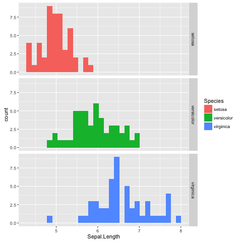
Fig. 13 Histogram of Iris sepal length data faceted and coloured by species.
Purpose of data visualisation
There are two main purposes of representing data visually:
- To explore the data
- To convey a message to an audience
So far we have been focussing on the former. Let us now think a little bit more about the latter, conveying a message to an audience. In other words creating figures for presentations and publications.
Conveying a message to an audience
The first step in creating an informative figure is to consider who the intended audience is. Is it the general public, school children or plant biologists? The general public may be interested in trends, whereas a plant scientist may be interested in a more detailed view.
Secondly, what is the message that you want to convey? Stating this explicitly will help you when making decisions about the content and the layout of the figure.
Thirdly, what medium will be used to display the figure? Will it be displayed for a minute on a projector or will it be printed in an article? The audience will have less time to absorb details from the former.
So suppose we wanted to create a figure intended for biologists, illustrating that there is not much variation in the local GC content of Streptomyces coelicolor A3(2), building on the example in Data analysis. Let us further suppose that the medium is in a printed journal where the figure can have a maximum width of 89 mm.
First of all make sure that you are in the S.coelicolor-local-GC-content
directory created in Data analysis.
$ cd S.coelicolor-local-GC-content
Now create a file named local_gc_content_figure.R and add the R code below
to it.
library("ggplot2")

df = read.csv("local_gc_content.csv", header=T)

g1 = ggplot(df, aes(x=middle, y=gc_content))
g2 = g1 + geom_line()

ggsave("local_gc_content.png", width=89, height=50, units="mm")
The code above loads the data and plots it as a line, resulting in a local GC
content plot. Note also that we specify the width and height of the plot in
millimeters in the ggsave() function.
Let’s try it out.
$ Rscript local_gc_content_figure.R
It should create a file named local_gc_content.png containing the image
in Fig. 14.
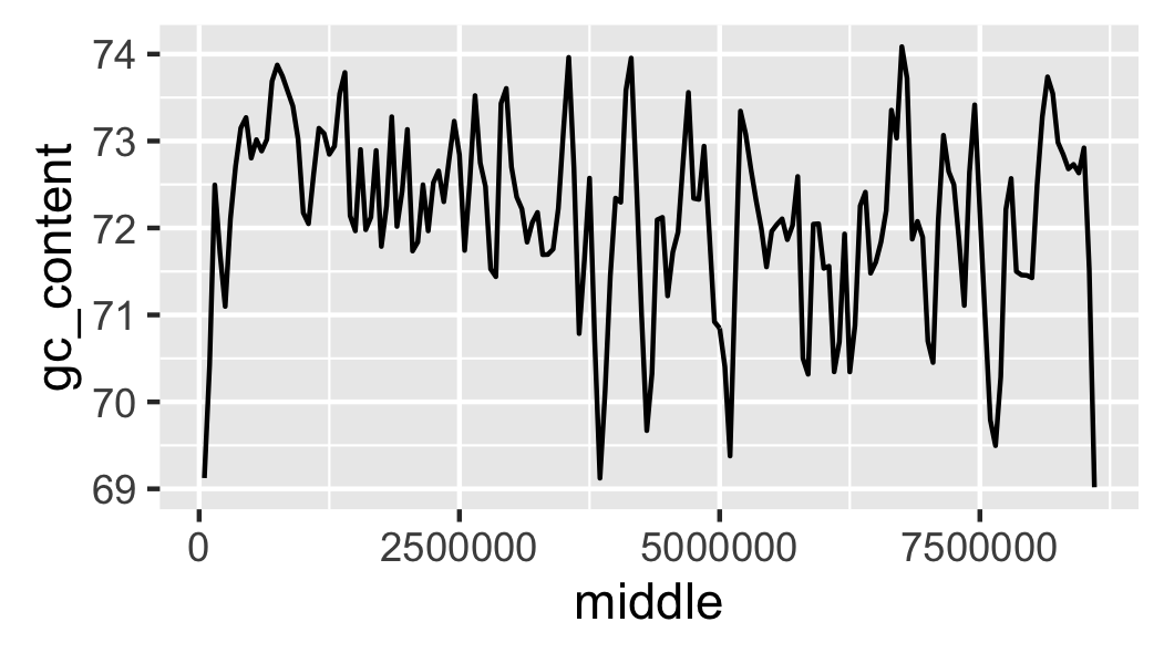
Fig. 14 Initial attempt at plotting local GC content.
The scale of the y-axis makes the plot misleading. It looks like there is a lot of variation in the data. Let’s expand the y range to span from 0 to 100 percent (Fig. 15).
library("ggplot2")

df = read.csv("local_gc_content.csv", header=T)

g1 = ggplot(df, aes(x=middle, y=gc_content))
g2 = g1 + geom_line()
g3 = g2 + ylim(0, 100)

ggsave("local_gc_content.png", width=89, height=50, units="mm")
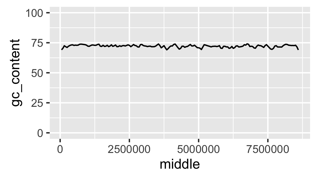
Fig. 15 Local GC content with y-axis scaled corretly.
At the moment it looks like the line is floating in mid-air. This is because ggplot adds some padding to the limits. Let’s turn this off (Fig. 16).
library("ggplot2")

df = read.csv("local_gc_content.csv", header=T)

g1 = ggplot(df, aes(x=middle, y=gc_content))
g2 = g1 + geom_line()
g3 = g2 + ylim(0, 100)
g4 = g3 + coord_cartesian(expand=FALSE)

ggsave("local_gc_content.png", width=89, height=50, units="mm")
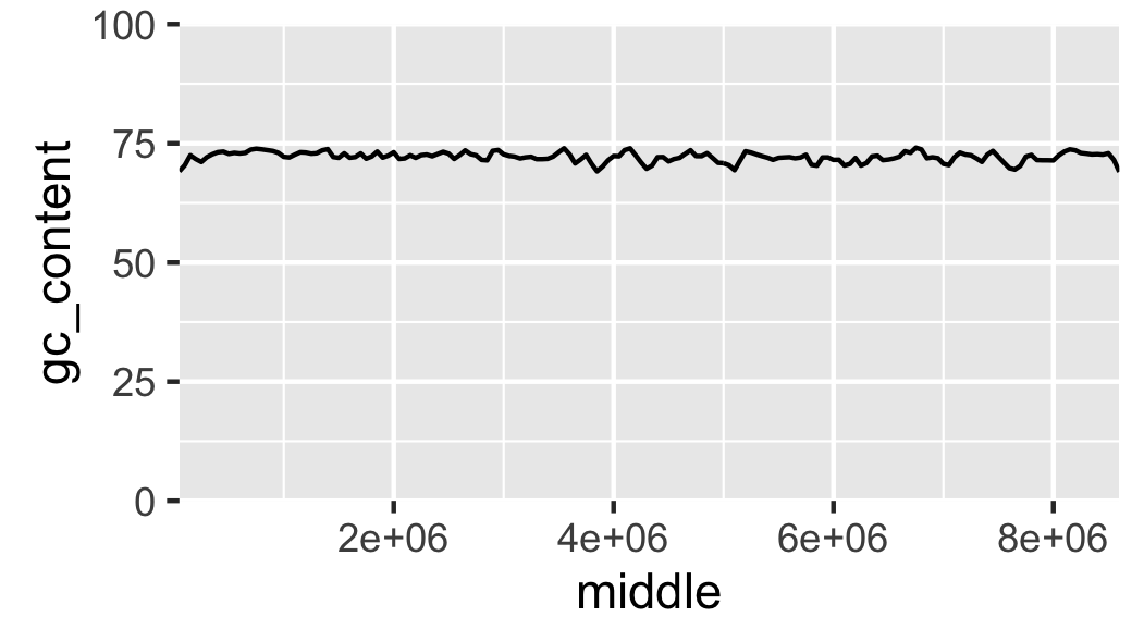
Fig. 16 Local GC content without padding.
The labels on the x-axis are a bit difficult to read. To make it easier to understand the content of the x-axis let’s scale it to use kilobases as its units (Fig. 17).
library("ggplot2")

df = read.csv("local_gc_content.csv", header=T)

g1 = ggplot(df, aes(x=middle, y=gc_content))
g2 = g1 + geom_line()
g3 = g2 + ylim(0, 100)
g4 = g3 + coord_cartesian(expand=FALSE)
g5 = g4 + scale_x_continuous(labels=function(x)x/1000)

ggsave("local_gc_content.png", width=89, height=50, units="mm")
In the above function(x)x/1000 is a function definition. The function
returns the input (x) divided by 1000. In this case the function is
passed anonymously (the function is not given a name) to the labels
argument of the scale_x_continuous() function.
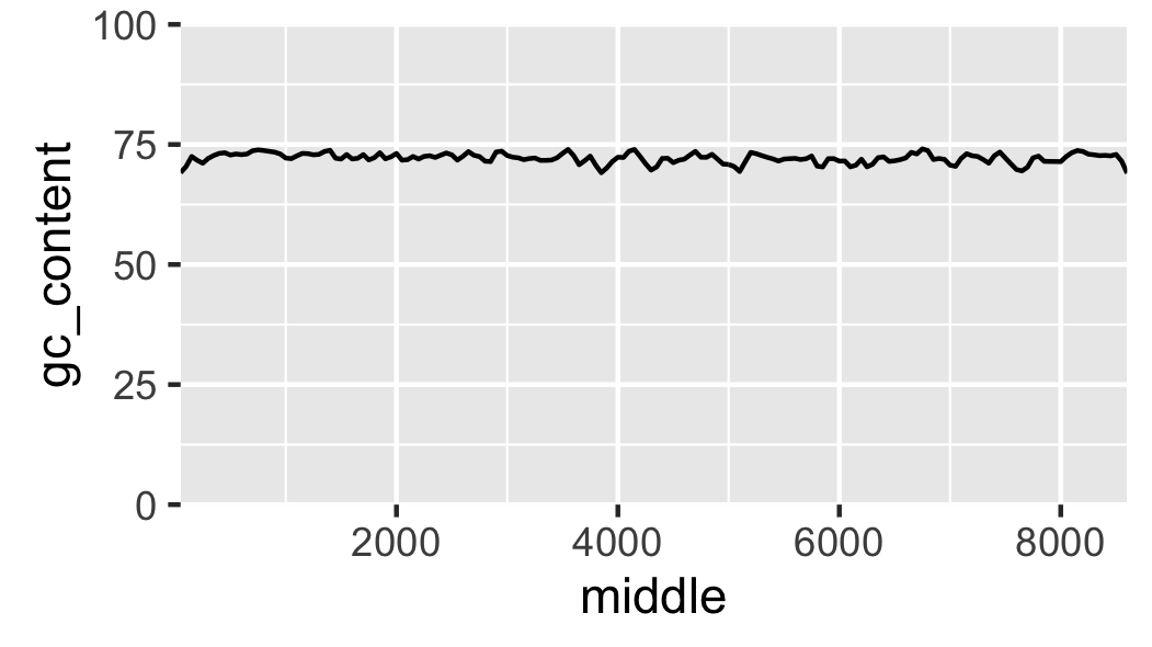
Fig. 17 Local GC content with kilobases as the x axis units.
Finally, let us add labels to the x-axis (Fig. 18).
library("ggplot2")

df = read.csv("local_gc_content.csv", header=T)

g1 = ggplot(df, aes(x=middle, y=gc_content))
g2 = g1 + geom_line()
g3 = g2 + ylim(0, 100)
g4 = g3 + coord_cartesian(expand=FALSE)
g5 = g4 + scale_x_continuous(labels=function(x)x/1000)
g6 = g5 + xlab("Nucleotide position (KB)") + ylab("GC content (%)")

ggsave("local_gc_content.png", width=89, height=50, units="mm")
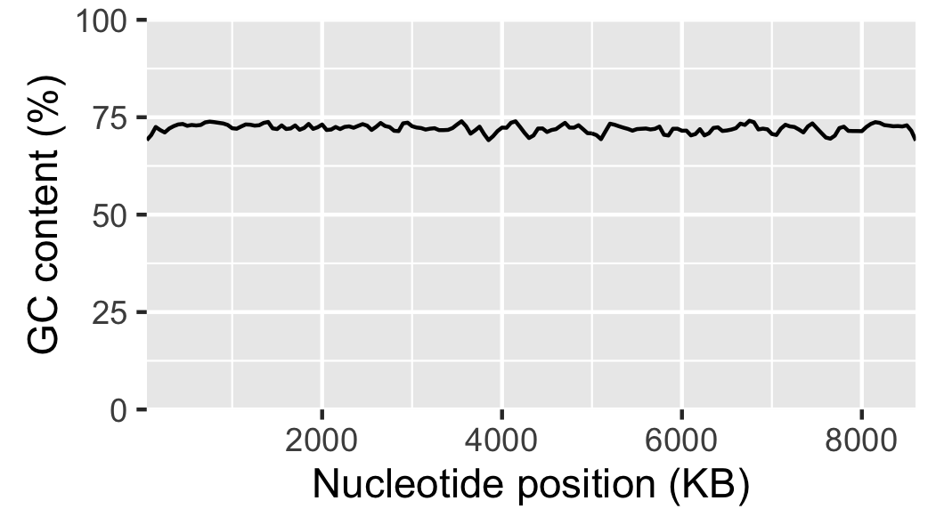
Fig. 18 Local GC content with labelled axis.
This is a good point to start tracking the local_gc_content_figure.R file
in version control, see Keeping track of your work for more details.
$ git status
On branch master
Untracked files:
  (use "git add <file>..." to include in what will be committed)

        local_gc_content.png
        local_gc_content_figure.R

nothing added to commit but untracked files present (use "git add" to track)
So we have two untracked files: the R script and the PNG file the R script
generates. We do not want to track the latter in version control as it can be
generated from the script. Let us therefore update our .gitignore file.
Sco.dna
local_gc_content.csv
local_gc_content.png
Let’s check the status of the Git repository now.
$ git status
On branch master
Changes not staged for commit:
  (use "git add <file>..." to update what will be committed)
  (use "git checkout -- <file>..." to discard changes in working directory)

        modified:   .gitignore

Untracked files:
  (use "git add <file>..." to include in what will be committed)

        local_gc_content_figure.R

no changes added to commit (use "git add" and/or "git commit -a")
Great, let us add the local_gc_content_figure.R and .gitignore files
and commit a snapshot.
$ git add local_gc_content_figure.R .gitignore
$ git commit -m "Added R script for generating local GC plot"
[master cba7277] Added R script for generating local GC plot
 2 files changed, 13 insertions(+)
 create mode 100644 local_gc_content_figure.R
Writing a caption
All figures require a caption to help the audience understand how to interpret the plot.
In this particular case two particular items stand out as missing from being able to interpret the plot. First of all what is the source of the DNA, i.e. where is the data from? Secondly, what was the window and step sizes of the sliding window analysis?
It would also be appropriate to explicitly state what the message of the plot is, i.e. that there is not much variation in the local GC content. In this case we could further substantiate this claim by citing the mean and standard deviation of the local GC content across the genome.
> df = read.csv("local_gc_content.csv", header=T)
> mean(df$gc_content)
[1] 72.13948
> sd(df$gc_content)
[1] 1.050728
Below is the final figure and its caption (Fig. 19). The caption has been added by the tool chain used to build this book, not by R.
Fig. 19 There is little variation in the local GC content of Streptomyces coelicolor A3(2). Using a window size of 100 KB and a step size of 50 KB the local GC content has a mean of 72.1% and a standard deviation of 1.1%.
Other useful tools for scripting the generation of figures
There are many different ways of visualising data and generating figures. A broad distinction can be made between ad-hoc methods, usually using graphical user interfaces and button clicking, and methods that can be automated, i.e. methods that can reproduce the figure without human intervention.
One take home message from this chapter is that you should automate the generation of your figures. This will save you time when you realise that you need to alter the style of all the figures when submitting a manuscript for publication. It will also make your research more reproducible.
Apart from R and ggplot2 there are several tools available for automating the generation of your figures. In Python there is the matplotlib package, which is very powerful and it is a great tool for plotting data generated from Python scripts. Gnuplot is a scripting language designed to plot data and mathematical functions, it is particularly good at depicting three-dimensional data.
If you are dealing with graphs, as in evolutionary trees and metabolic pathways, it is worth having a look at Graphviz.
A general purpose tool for manipulating images on the command line is ImageMagick. It can be used to resize, crop and transform your images. It is a great tool for automating your image manipulation.
If you are wanting to visualise data in web pages it is worth investing some time looking at the various JavaScript libraries available for data visualisation. One poplar option is D3.js.
Key concepts
- R and ggplot2 are powerful tools for visualising data
- R should also be your first port of call for statistical computing (statistical computing is not covered in this book)
- In ggplot2 the visual representation of your data is built up using layers
- Separating out different aspects of plotting into different layers makes it easier to reason about the data and the best way to represent it visually
- Faceting allows you to separate out data on one or more variables, this is one of the strengths of ggplot2
- Scripting your data visualisation makes it easier to modify later on
- Scripting your data visualisation makes it reproducible
- When creating a figure ask yourself: who is the audience and what is the message